- 公開日
- 最終更新日
【Plotly】で簡単グラフ作成
この記事を共有する



目次
パーソル&サーバーワークスの印鑰です。
AWSを中心としたクラウドインフラの設計・構築・運用を担当しています。 エージェント開発にも注力しているエンジニアです。
このブログで学べること
このブログでは、Plotly を使ってインタラクティブなグラフを簡単に作成し、AWS で公開するまでの一連の流れを体験できます。
| 項目 | 説明 |
|---|---|
| Plotly.js(CDN)による HTML グラフ作成 | CDN の <script> タグ1行でインストール不要。3段階でシンプルからモダンデザインに進化させる |
| AWS CloudShell + Python による HTML 自動生成 | AWS CloudShell 上で Python を実行し、モダンなグラフ付き HTML を自動生成して Amazon S3 に配置 |
| Amazon S3 静的 Web ホスティングで公開 | 生成した HTML を Amazon S3 の静的 Web ホスティング機能でブラウザから閲覧可能に |
どんな人向け?
- データの可視化を手軽に試したい方
- ローカル環境へのインストールなしでグラフを作りたい方
- AWS CloudShell と Amazon S3 だけでサクッと可視化ページを公開したい方
- BIツールほどの機能は不要だけど、インタラクティブなグラフが欲しい方
1.概要
このブログのポイントは次のとおりです。
| ポイント | 説明 |
|---|---|
| インストール不要 | Plotly.js は CDN から読み込むだけ。ローカル環境に何もインストールする必要なし |
| インタラクティブ | マウスホバーで値を表示、ズーム、パンなど、静的画像にはないリッチな操作が可能 |
| 3段階で進化 | シンプル → スタイル調整 → モダンダッシュボード と段階的にデザインを改善 |
| AWS CloudShell 完結 | AWS CloudShell には Python がプリインストール済み。追加セットアップ不要で即実行 |
| Amazon S3 静的 Web ホスティング | 生成した HTML を Amazon S3 に置くだけでブラウザからアクセス可能 |
補足: Plotly はオープンソースのグラフ描画ライブラリで、JavaScript 版(Plotly.js)と Python 版(plotly.py)があります。本ブログでは JavaScript 版の CDN を HTML に読み込んで描画します。Python は HTML の生成と Amazon S3 アップロードに使用します。
2.システムアーキテクチャ
全体構成図
- フェーズ1: ローカル環境

- フェーズ2: AWS 環境
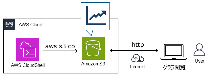
3.前提条件
ハンズオンをはじめる前に、以下をお読みください。
所要時間
- 約 30 分
- フェーズ1(ローカル HTML 3段階):約 10 分
- フェーズ2(AWS CloudShell + Amazon S3):約 20 分
必要な権限
以下の権限が必要です。
- AWS マネジメントコンソールにアクセスできること
- AWS CloudShell を利用できること
- Amazon S3 バケットの作成・オブジェクトのアップロード・バケットポリシーの設定ができること
リージョン
東京リージョン(ap-northeast-1)で作業します。
開発環境
- ブラウザ(Chrome または Firefox)
- テキストエディタ(メモ帳など何でもOK)
費用について
- AWS CloudShell:無料
- Amazon S3:ストレージ料金はごく僅か(HTML ファイル数 KB 程度のため、実質無料に近い)
大事なポイント: Amazon S3 バケットを静的 Web ホスティングとして公開する場合、アクセス量に応じたリクエスト料金が発生します。検証後は不要なバケットを削除してください。
4.ローカルで Plotly グラフを作成(3段階)
さあ、ここからが本番です。一緒に作っていきましょう。
Plotly.js の CDN を使い、ローカル PC 上で折れ線グラフを3段階に分けて進化させます。
ステップ一覧
| Step | テーマ | 変更点 |
|---|---|---|
| Step1 | シンプル | 最小限のコードで動くグラフ |
| Step2 | スタイル調整 | カード UI、色指定、フォント調整 |
| Step3 | モダン化 | ダークテーマ、ガラスモーフィズム、KPIカード、フェードインアニメーション |
Step1: シンプル -- 最小限で動かす
1.ローカル PC で step1-simple.html という名前のファイルを作って、以下の内容をコピー&ペーストして保存してください。
ここを押すと展開します
<!DOCTYPE html>
<html lang="ja">
<head>
    <meta charset="UTF-8">
    <meta name="viewport" content="width=device-width, initial-scale=1.0">
    <title>Plotly.js 折れ線グラフ - Step1: シンプル</title>
    <!-- Plotly.js CDN -->
    <script src="https://cdn.plot.ly/plotly-latest.min.js"></script>
</head>
<body>
    <h1>月別売上推移</h1>
    <div id="chart"></div>
    <script>
        // サンプルデータ
        const months = ['4月', '5月', '6月', '7月', '8月', '9月', '10月', '11月', '12月', '1月', '2月', '3月'];
        // 商品Aの売上データ
        const traceA = {
            x: months,
            y: [120, 135, 148, 160, 175, 190, 210, 195, 180, 200, 220, 250],
            type: 'scatter',
            mode: 'lines+markers',
            name: '商品A'
        };
        // 商品Bの売上データ
        const traceB = {
            x: months,
            y: [80, 95, 110, 105, 120, 140, 155, 165, 150, 170, 185, 200],
            type: 'scatter',
            mode: 'lines+markers',
            name: '商品B'
        };
        // レイアウト
        const layout = {
            title: '2026年4月〜2027年3月 月別売上推移',
            xaxis: { title: '月' },
            yaxis: { title: '売上(万円)' }
        };
        // 描画
        Plotly.newPlot('chart', [traceA, traceB], layout);
    </script>
</body>
</html>
2.step1-simple.html をブラウザで開くと、Plotly のデフォルトスタイルでグラフが表示されます。
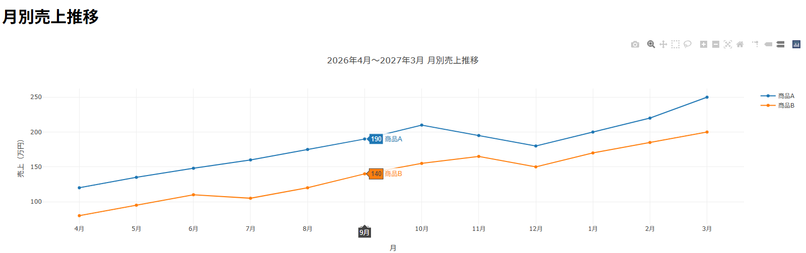
補足: たったこれだけのコードで、ホバーで値を確認、ドラッグでズームなどインタラクティブな操作が可能です。CDN の
<script>タグ1行がポイントです。
Step2: スタイル調整 -- 見た目を整える
1.step2-styled.html という名前のファイルを作って、以下の内容をコピー&ペーストして保存してください。
ここを押すと展開します
<!DOCTYPE html>
<html lang="ja">
<head>
    <meta charset="UTF-8">
    <meta name="viewport" content="width=device-width, initial-scale=1.0">
    <title>Plotly.js 折れ線グラフ - Step2: スタイル調整</title>
    <script src="https://cdn.plot.ly/plotly-latest.min.js"></script>
    <style>
        body {
            font-family: 'Segoe UI', Tahoma, Geneva, Verdana, sans-serif;
            margin: 0;
            padding: 40px 20px;
            background-color: #f8fafc;
        }
        .container { max-width: 900px; margin: 0 auto; }
        h1 { text-align: center; color: #1e293b; font-size: 24px; margin-bottom: 8px; }
        .subtitle { text-align: center; color: #64748b; font-size: 14px; margin-bottom: 24px; }
        .chart-card {
            background: #fff;
            border-radius: 12px;
            box-shadow: 0 1px 3px rgba(0,0,0,0.1), 0 4px 12px rgba(0,0,0,0.05);
            padding: 24px;
        }
    </style>
</head>
<body>
    <div class="container">
        <h1>月別売上推移</h1>
        <p class="subtitle">2026年4月〜2027年3月 | 商品A・商品B 比較</p>
        <div class="chart-card">
            <div id="chart"></div>
        </div>
    </div>
    <script>
        const months = ['4月', '5月', '6月', '7月', '8月', '9月', '10月', '11月', '12月', '1月', '2月', '3月'];
        const traceA = {
            x: months,
            y: [120, 135, 148, 160, 175, 190, 210, 195, 180, 200, 220, 250],
            type: 'scatter', mode: 'lines+markers', name: '商品A',
            line: { color: '#3b82f6', width: 2.5 },
            marker: { size: 6 }
        };
        const traceB = {
            x: months,
            y: [80, 95, 110, 105, 120, 140, 155, 165, 150, 170, 185, 200],
            type: 'scatter', mode: 'lines+markers', name: '商品B',
            line: { color: '#f59e0b', width: 2.5 },
            marker: { size: 6 }
        };
        const layout = {
            font: { family: 'Segoe UI, sans-serif' },
            xaxis: { title: '', gridcolor: '#f1f5f9' },
            yaxis: { title: '売上(万円)', gridcolor: '#f1f5f9' },
            legend: { x: 0.01, y: 0.99 },
            hovermode: 'x unified',
            margin: { t: 10, b: 40, l: 60, r: 20 }
        };
        Plotly.newPlot('chart', [traceA, traceB], layout, { responsive: true, displaylogo: false });
    </script>
</body>
</html>
2.step2-styled.html をブラウザで開くと、スタイル調整されたグラフが表示されます。
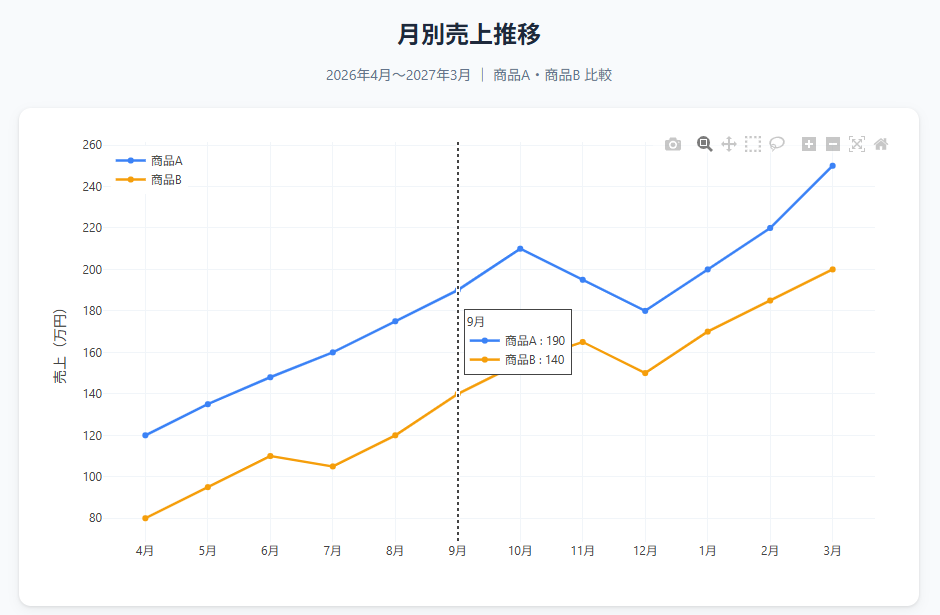
Step1 からの変更点:
| 項目 | 変更内容 |
|---|---|
| 背景 | #f8fafc の薄いグレー |
| カード | 白背景 + border-radius + box-shadow で浮き上がるカード |
| 線の色 | ブランドカラー指定(青 #3b82f6、オレンジ #f59e0b) |
| レイアウト | タイトルを HTML 側に移動、グリッド線を薄くしてすっきり |
| ホバー | hovermode: 'x unified' で同じX軸上の値をまとめて表示 |
Step3: モダン化 -- ダッシュボード風に仕上げる
1.step3-modern.html という名前のファイルを作って、以下の内容をコピー&ペーストして保存してください。
ここを押すと展開します
<!DOCTYPE html>
<html lang="ja">
<head>
    <meta charset="UTF-8">
    <meta name="viewport" content="width=device-width, initial-scale=1.0">
    <title>Plotly.js 折れ線グラフ - Step3: モダン</title>
    <!-- Plotly.js CDN -->
    <script src="https://cdn.plot.ly/plotly-latest.min.js"></script>
    <!-- Google Fonts -->
    <link rel="preconnect" href="https://fonts.googleapis.com">
    <link rel="preconnect" href="https://fonts.gstatic.com" crossorigin>
    <link href="https://fonts.googleapis.com/css2?family=Inter:wght@300;400;500;600;700&display=swap" rel="stylesheet">
    <style>
        * {
            margin: 0;
            padding: 0;
            box-sizing: border-box;
        }
        body {
            font-family: 'Inter', -apple-system, BlinkMacSystemFont, sans-serif;
            background: linear-gradient(135deg, #0f0c29, #302b63, #24243e);
            min-height: 100vh;
            padding: 40px 20px;
            color: #e0e0e0;
        }
        .container {
            max-width: 1000px;
            margin: 0 auto;
        }
        .header {
            text-align: center;
            margin-bottom: 32px;
        }
        .header h1 {
            font-size: 28px;
            font-weight: 600;
            background: linear-gradient(90deg, #667eea, #764ba2);
            -webkit-background-clip: text;
            -webkit-text-fill-color: transparent;
            background-clip: text;
            margin-bottom: 8px;
        }
        .header p {
            font-size: 14px;
            color: #9ca3af;
            font-weight: 300;
        }
        .card {
            background: rgba(255, 255, 255, 0.05);
            backdrop-filter: blur(20px);
            -webkit-backdrop-filter: blur(20px);
            border: 1px solid rgba(255, 255, 255, 0.1);
            border-radius: 16px;
            padding: 32px;
            box-shadow: 0 8px 32px rgba(0, 0, 0, 0.3);
        }
        .stats {
            display: grid;
            grid-template-columns: repeat(auto-fit, minmax(200px, 1fr));
            gap: 16px;
            margin-bottom: 24px;
        }
        .stat-item {
            background: rgba(255, 255, 255, 0.03);
            border: 1px solid rgba(255, 255, 255, 0.06);
            border-radius: 12px;
            padding: 16px 20px;
            text-align: center;
        }
        .stat-item .label {
            font-size: 12px;
            color: #9ca3af;
            text-transform: uppercase;
            letter-spacing: 0.5px;
            margin-bottom: 4px;
        }
        .stat-item .value {
            font-size: 24px;
            font-weight: 600;
        }
        .stat-item .value.blue { color: #667eea; }
        .stat-item .value.orange { color: #f093fb; }
        .stat-item .value.green { color: #4ade80; }
        #chart {
            border-radius: 12px;
            overflow: hidden;
        }
        .footer {
            text-align: center;
            margin-top: 24px;
            font-size: 12px;
            color: #6b7280;
        }
        .badge {
            display: inline-block;
            background: rgba(102, 126, 234, 0.15);
            border: 1px solid rgba(102, 126, 234, 0.3);
            color: #667eea;
            font-size: 11px;
            font-weight: 500;
            padding: 4px 10px;
            border-radius: 20px;
            margin-top: 8px;
        }
        /* フェードイン アニメーション */
        @keyframes fadeInUp {
            from { opacity: 0; transform: translateY(20px); }
            to { opacity: 1; transform: translateY(0); }
        }
        @keyframes fadeIn {
            from { opacity: 0; }
            to { opacity: 1; }
        }
        .header { animation: fadeInUp 0.6s ease-out; }
        .card { animation: fadeInUp 0.8s ease-out 0.2s both; }
        .stat-item:nth-child(1) { animation: fadeInUp 0.5s ease-out 0.4s both; }
        .stat-item:nth-child(2) { animation: fadeInUp 0.5s ease-out 0.55s both; }
        .stat-item:nth-child(3) { animation: fadeInUp 0.5s ease-out 0.7s both; }
        #chart { animation: fadeIn 1s ease-out 0.8s both; }
        .footer { animation: fadeIn 0.6s ease-out 1.2s both; }
    </style>
</head>
<body>
    <div class="container">
        <div class="header">
            <h1>Monthly Sales Dashboard</h1>
            <p>2026年4月〜2027年3月 月別売上推移 -- Plotly.js CDN で描画</p>
            <span class="badge">Interactive Chart</span>
        </div>
        <div class="card">
            <div class="stats">
                <div class="stat-item">
                    <div class="label">商品A 年間合計</div>
                    <div class="value blue">2,183万円</div>
                </div>
                <div class="stat-item">
                    <div class="label">商品B 年間合計</div>
                    <div class="value orange">1,575万円</div>
                </div>
                <div class="stat-item">
                    <div class="label">前年比成長率</div>
                    <div class="value green">+18.2%</div>
                </div>
            </div>
            <div id="chart"></div>
        </div>
        <div class="footer">
            Powered by Plotly.js CDN · AWS CloudShell + Amazon S3
        </div>
    </div>
    <script>
        // サンプルデータ: 月別売上推移
        const months = ['4月', '5月', '6月', '7月', '8月', '9月', '10月', '11月', '12月', '1月', '2月', '3月'];
        // 商品Aの売上データ
        const traceA = {
            x: months,
            y: [120, 135, 148, 160, 175, 190, 210, 195, 180, 200, 220, 250],
            type: 'scatter',
            mode: 'lines+markers',
            name: '商品A',
            line: { color: '#667eea', width: 3, shape: 'spline' },
            marker: { size: 7, color: '#667eea', line: { color: '#fff', width: 2 } },
            fill: 'tozeroy',
            fillcolor: 'rgba(102, 126, 234, 0.08)'
        };
        // 商品Bの売上データ
        const traceB = {
            x: months,
            y: [80, 95, 110, 105, 120, 140, 155, 165, 150, 170, 185, 200],
            type: 'scatter',
            mode: 'lines+markers',
            name: '商品B',
            line: { color: '#f093fb', width: 3, shape: 'spline' },
            marker: { size: 7, color: '#f093fb', line: { color: '#fff', width: 2 } },
            fill: 'tozeroy',
            fillcolor: 'rgba(240, 147, 251, 0.05)'
        };
        // レイアウト設定(ダークテーマ)
        const layout = {
            font: { family: 'Inter, sans-serif', color: '#9ca3af' },
            paper_bgcolor: 'rgba(0,0,0,0)',
            plot_bgcolor: 'rgba(0,0,0,0)',
            xaxis: {
                title: '',
                gridcolor: 'rgba(255,255,255,0.05)',
                linecolor: 'rgba(255,255,255,0.1)',
                tickfont: { size: 12 }
            },
            yaxis: {
                title: '売上(万円)',
                gridcolor: 'rgba(255,255,255,0.05)',
                linecolor: 'rgba(255,255,255,0.1)',
                tickfont: { size: 12 },
                titlefont: { size: 13 }
            },
            legend: { x: 0.01, y: 0.99, bgcolor: 'rgba(0,0,0,0)', font: { size: 12 } },
            hovermode: 'x unified',
            hoverlabel: {
                bgcolor: 'rgba(30, 30, 50, 0.95)',
                bordercolor: 'rgba(255,255,255,0.1)',
                font: { family: 'Inter, sans-serif', size: 13 }
            },
            margin: { t: 20, b: 40, l: 60, r: 20 }
        };
        // 設定
        const config = {
            responsive: true,
            displayModeBar: true,
            modeBarButtonsToRemove: ['lasso2d', 'select2d'],
            displaylogo: false
        };
        // グラフの描画
        Plotly.newPlot('chart', [traceA, traceB], layout, config);
    </script>
</body>
</html>
2.step3-modern.html をブラウザで開くと、モダン化されたグラフが表示されます。
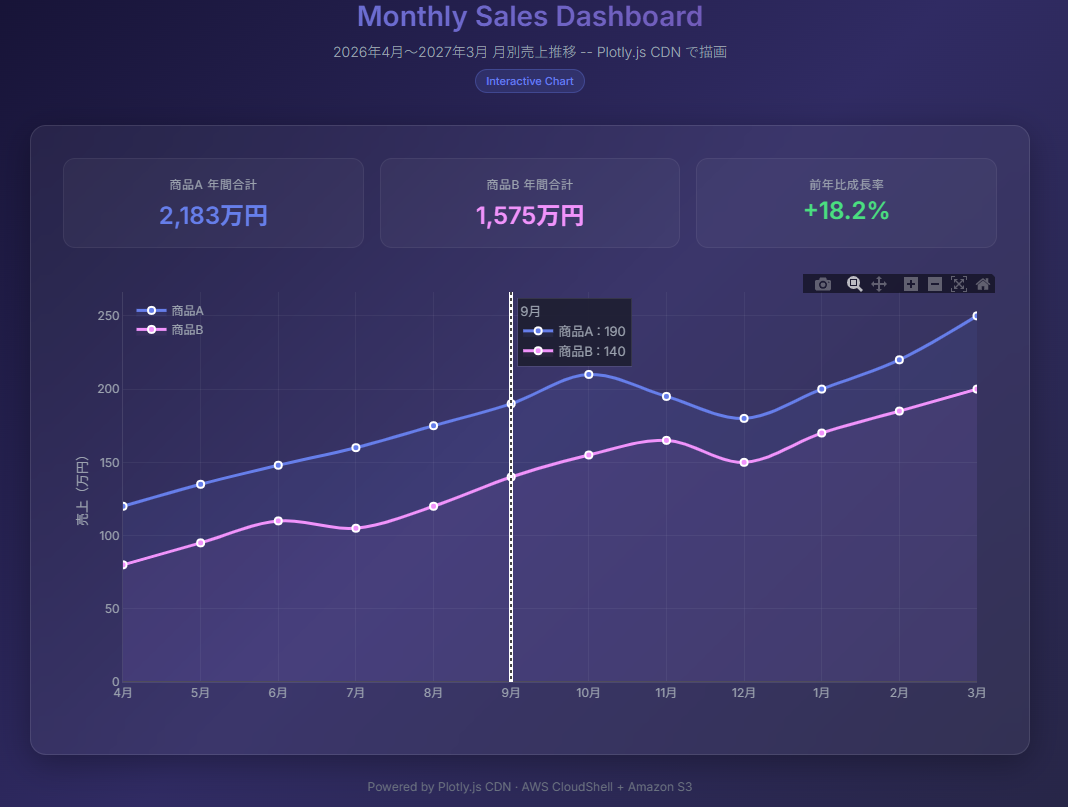
Step2 からの変更点:
| 項目 | 変更内容 |
|---|---|
| 背景 | ダークグラデーション(#0f0c29 → #302b63 → #24243e) |
| カード | ガラスモーフィズム(backdrop-filter: blur + 半透明) |
| タイトル | グラデーション文字色(紫 → 青) |
| フォント | Google Fonts「Inter」 |
| KPI カード | グラフ上部に年間合計・成長率を表示 |
| 折れ線 | スプライン曲線 + エリア塗りつぶし |
| アニメーション | CSS フェードインで要素が順番に出現 |
補足: 3つの HTML すべてで、Plotly.js の CDN(
https://cdn.plot.ly/plotly-latest.min.js)を読み込んでいます。ローカルへのインストールは不要です。
5.AWS CloudShell で Python を使って HTML を生成 & Amazon S3 にアップロード
ここからは AWS 上での作業です。AWS CloudShell で Python スクリプトを実行し、Step3 のモダンデザインの HTML を生成して Amazon S3 にアップロードします。
補足: AWS CloudShell には Python 3 がプリインストールされています。今回のスクリプトは標準ライブラリ(
json,subprocess)のみ使用するため、pip installは不要です。
5-1. AWS CloudShell を開く
- AWS マネジメントコンソールにログイン
- 画面上部のナビゲーションバーにある AWS CloudShell アイコンを押下
- AWS CloudShell が起動するまで待機
5-2. Amazon S3 バケットの作成
1.AWS CloudShell で以下のコマンドを実行します。
aws s3 mb s3://plotly-dashboard-{AWSアカウントID} --region ap-northeast-1
想定される実行結果:
make_bucket: plotly-dashboard-{AWSアカウントID}
大事なポイント:
{AWSアカウントID}はご自身の AWS アカウント ID(12桁の数字)に置き換えてください。Amazon S3 バケット名はグローバルで一意である必要があるため、アカウント ID を含めることで重複を防ぎます。
5-3. Python スクリプトの作成
AWS CloudShell 上で、Python スクリプトを作成します。
1.AWS CloudShell で以下のコマンドを実行します。
ここを押すと展開します
cat << 'EOF' > generate_plotly_chart.py
"""
Plotly グラフを含むモダンデザインの HTML ファイルを生成し、Amazon S3 にアップロードするスクリプト
AWS CloudShell 上で実行する想定
"""
import json
import subprocess
import sys
# === 設定 ===
# S3バケット名を指定してください
S3_BUCKET = "your-bucket-name"
# 出力ファイル名
OUTPUT_FILE = "index.html"
def generate_html():
"""Plotly.js の折れ線グラフを含むモダンデザインの HTML を生成する"""
# サンプルデータ: 月別売上推移
months = ["4月", "5月", "6月", "7月", "8月", "9月",
"10月", "11月", "12月", "1月", "2月", "3月"]
# 商品Aの売上データ
trace_a = {
"x": months,
"y": [120, 135, 148, 160, 175, 190, 210, 195, 180, 200, 220, 250],
"type": "scatter",
"mode": "lines+markers",
"name": "商品A",
"line": {"color": "#667eea", "width": 3, "shape": "spline"},
"marker": {"size": 7, "color": "#667eea", "line": {"color": "#fff", "width": 2}},
"fill": "tozeroy",
"fillcolor": "rgba(102, 126, 234, 0.08)"
}
# 商品Bの売上データ
trace_b = {
"x": months,
"y": [80, 95, 110, 105, 120, 140, 155, 165, 150, 170, 185, 200],
"type": "scatter",
"mode": "lines+markers",
"name": "商品B",
"line": {"color": "#f093fb", "width": 3, "shape": "spline"},
"marker": {"size": 7, "color": "#f093fb", "line": {"color": "#fff", "width": 2}},
"fill": "tozeroy",
"fillcolor": "rgba(240, 147, 251, 0.05)"
}
# レイアウト設定(ダークテーマ)
layout = {
"font": {"family": "Inter, sans-serif", "color": "#9ca3af"},
"paper_bgcolor": "rgba(0,0,0,0)",
"plot_bgcolor": "rgba(0,0,0,0)",
"xaxis": {
"title": "",
"gridcolor": "rgba(255,255,255,0.05)",
"linecolor": "rgba(255,255,255,0.1)",
"tickfont": {"size": 12}
},
"yaxis": {
"title": "売上(万円)",
"gridcolor": "rgba(255,255,255,0.05)",
"linecolor": "rgba(255,255,255,0.1)",
"tickfont": {"size": 12},
"titlefont": {"size": 13}
},
"legend": {"x": 0.01, "y": 0.99, "bgcolor": "rgba(0,0,0,0)", "font": {"size": 12}},
"hovermode": "x unified",
"hoverlabel": {
"bgcolor": "rgba(30, 30, 50, 0.95)",
"bordercolor": "rgba(255,255,255,0.1)",
"font": {"family": "Inter, sans-serif", "size": 13}
},
"margin": {"t": 20, "b": 40, "l": 60, "r": 20}
}
# JSON に変換
data_json = json.dumps([trace_a, trace_b], ensure_ascii=False)
layout_json = json.dumps(layout, ensure_ascii=False)
# HTML テンプレート(プレースホルダー置換方式)
html_template = """<!DOCTYPE html>
<html lang="ja">
<head>
<meta charset="UTF-8">
<meta name="viewport" content="width=device-width, initial-scale=1.0">
<title>Monthly Sales Dashboard</title>
<script src="https://cdn.plot.ly/plotly-latest.min.js"></script>
<link rel="preconnect" href="https://fonts.googleapis.com">
<link rel="preconnect" href="https://fonts.gstatic.com" crossorigin>
<link href="https://fonts.googleapis.com/css2?family=Inter:wght@300;400;500;600;700&display=swap" rel="stylesheet">
<style>
* { margin: 0; padding: 0; box-sizing: border-box; }
body {
font-family: 'Inter', -apple-system, BlinkMacSystemFont, sans-serif;
background: linear-gradient(135deg, #0f0c29, #302b63, #24243e);
min-height: 100vh;
padding: 40px 20px;
color: #e0e0e0;
}
.container { max-width: 1000px; margin: 0 auto; }
.header { text-align: center; margin-bottom: 32px; }
.header h1 {
font-size: 28px; font-weight: 600;
background: linear-gradient(90deg, #667eea, #764ba2);
-webkit-background-clip: text; -webkit-text-fill-color: transparent;
background-clip: text; margin-bottom: 8px;
}
.header p { font-size: 14px; color: #9ca3af; font-weight: 300; }
.card {
background: rgba(255, 255, 255, 0.05);
backdrop-filter: blur(20px); -webkit-backdrop-filter: blur(20px);
border: 1px solid rgba(255, 255, 255, 0.1);
border-radius: 16px; padding: 32px;
box-shadow: 0 8px 32px rgba(0, 0, 0, 0.3);
}
.stats {
display: grid; grid-template-columns: repeat(auto-fit, minmax(200px, 1fr));
gap: 16px; margin-bottom: 24px;
}
.stat-item {
background: rgba(255, 255, 255, 0.03);
border: 1px solid rgba(255, 255, 255, 0.06);
border-radius: 12px; padding: 16px 20px; text-align: center;
}
.stat-item .label {
font-size: 12px; color: #9ca3af;
text-transform: uppercase; letter-spacing: 0.5px; margin-bottom: 4px;
}
.stat-item .value { font-size: 24px; font-weight: 600; }
.stat-item .value.blue { color: #667eea; }
.stat-item .value.orange { color: #f093fb; }
.stat-item .value.green { color: #4ade80; }
#chart { border-radius: 12px; overflow: hidden; }
.footer { text-align: center; margin-top: 24px; font-size: 12px; color: #6b7280; }
.badge {
display: inline-block;
background: rgba(102, 126, 234, 0.15);
border: 1px solid rgba(102, 126, 234, 0.3);
color: #667eea; font-size: 11px; font-weight: 500;
padding: 4px 10px; border-radius: 20px; margin-top: 8px;
}
@keyframes fadeInUp {
from { opacity: 0; transform: translateY(20px); }
to { opacity: 1; transform: translateY(0); }
}
@keyframes fadeIn { from { opacity: 0; } to { opacity: 1; } }
.header { animation: fadeInUp 0.6s ease-out; }
.card { animation: fadeInUp 0.8s ease-out 0.2s both; }
.stat-item:nth-child(1) { animation: fadeInUp 0.5s ease-out 0.4s both; }
.stat-item:nth-child(2) { animation: fadeInUp 0.5s ease-out 0.55s both; }
.stat-item:nth-child(3) { animation: fadeInUp 0.5s ease-out 0.7s both; }
#chart { animation: fadeIn 1s ease-out 0.8s both; }
.footer { animation: fadeIn 0.6s ease-out 1.2s both; }
</style>
</head>
<body>
<div class="container">
<div class="header">
<h1>Monthly Sales Dashboard</h1>
<p>2026年4月〜2027年3月 月別売上推移 — Python + Plotly.js CDN で生成</p>
<span class="badge">Generated by CloudShell</span>
</div>
<div class="card">
<div class="stats">
<div class="stat-item">
<div class="label">商品A 年間合計</div>
<div class="value blue">2,183万円</div>
</div>
<div class="stat-item">
<div class="label">商品B 年間合計</div>
<div class="value orange">1,575万円</div>
</div>
<div class="stat-item">
<div class="label">前年比成長率</div>
<div class="value green">+18.2%</div>
</div>
</div>
<div id="chart"></div>
</div>
<div class="footer">
Powered by Plotly.js CDN · AWS CloudShell + S3
</div>
</div>
<script>
var data = __DATA_JSON__;
var layout = __LAYOUT_JSON__;
var config = { responsive: true, displayModeBar: true, modeBarButtonsToRemove: ['lasso2d', 'select2d'], displaylogo: false };
Plotly.newPlot('chart', data, layout, config);
</script>
</body>
</html>"""
# プレースホルダーを実際の値で置換
html_content = html_template.replace("__DATA_JSON__", data_json)
html_content = html_content.replace("__LAYOUT_JSON__", layout_json)
return html_content
def save_html(html_content, filename):
"""HTML ファイルをローカルに保存する"""
with open(filename, "w", encoding="utf-8") as f:
f.write(html_content)
print("[OK] HTML ファイルを生成しました: {}".format(filename))
def upload_to_s3(filename, bucket):
"""AWS CLI を使って S3 にアップロードする"""
s3_path = "s3://{}/{}".format(bucket, filename)
cmd = ["aws", "s3", "cp", filename, s3_path, "--content-type", "text/html"]
print("[INFO] S3 にアップロード中: {}".format(s3_path))
result = subprocess.run(cmd, capture_output=True, text=True)
if result.returncode == 0:
print("[OK] アップロード完了: {}".format(s3_path))
else:
print("[ERROR] アップロード失敗: {}".format(result.stderr))
sys.exit(1)
def main():
"""メイン処理"""
print("=" * 50)
print("Plotly グラフ HTML 生成 & S3 アップロード")
print("=" * 50)
# HTML 生成
html_content = generate_html()
save_html(html_content, OUTPUT_FILE)
# S3 にアップロード
upload_to_s3(OUTPUT_FILE, S3_BUCKET)
# 静的Webホスティング URL を表示
print("")
print("[INFO] 静的Webホスティング URL:")
print(" http://{}.s3-website-ap-northeast-1.amazonaws.com/".format(S3_BUCKET))
print("")
print("=" * 50)
print("[完了] すべての処理が正常に終了しました。")
print("=" * 50)
if __name__ == "__main__":
main()
EOF
5-4. バケット名の変更
スクリプト内の S3_BUCKET を、ご自身の Amazon S3 バケット名に変更します。
1.AWS CloudShell で以下のコマンドを実行します。
sed -i 's/your-bucket-name/plotly-dashboard-{AWSアカウントID}/g' generate_plotly_chart.py
5-5. スクリプトの実行
1.AWS CloudShell で以下のコマンドを実行します。
python3 generate_plotly_chart.py
想定される実行結果:
==================================================
Plotly グラフ HTML 生成 & S3 アップロード
==================================================
[OK] HTML ファイルを生成しました: index.html
[INFO] S3 にアップロード中: s3://plotly-dashboard-{AWSアカウントID}/index.html
[OK] アップロード完了: s3://plotly-dashboard-{AWSアカウントID}/index.html
[INFO] 静的Webホスティング URL:
  http://plotly-dashboard-{AWSアカウントID}.s3-website-ap-northeast-1.amazonaws.com/
==================================================
[完了] すべての処理が正常に終了しました。
==================================================
6.Amazon S3 静的 Web ホスティングでグラフを公開
Amazon S3 の静的 Web ホスティング機能を有効にして、ブラウザからアクセスできるようにします。接続元 IP アドレスで制限をかけることで、セキュリティも確保します。
6-1. グローバル IP アドレスの確認
バケットポリシーで接続元を制限するため、まずグラフを閲覧する PC のグローバル IP アドレスを確認します。
1.ローカル PC のブラウザで以下の URL にアクセスしてください。
https://checkip.amazonaws.com
想定される実行結果:
xxx.xxx.xxx.xxx
表示された IP アドレスを控えてください。次のステップで使用します。
6-2. バケットポリシーの設定(IP 制限付き)
バケットポリシーに Condition を追加し、6-1 で確認したグローバル IP アドレスからのみアクセスを許可します。
1.AWS CloudShell で以下のコマンドを実行します。
cat << 'EOF' > bucket-policy.json
{
    "Version": "2012-10-17",
    "Statement": [
        {
            "Sid": "AllowSpecificIP",
            "Effect": "Allow",
            "Principal": "*",
            "Action": "s3:GetObject",
            "Resource": "arn:aws:s3:::plotly-dashboard-{AWSアカウントID}/*",
            "Condition": {
                "IpAddress": {
                    "aws:SourceIp": "xxx.xxx.xxx.xxx/32"
                }
            }
        }
    ]
}
EOF
大事なポイント: 以下の2箇所を実際の値に置き換えてください。
{AWSアカウントID}→ ご自身の AWS アカウント ID(12桁の数字)xxx.xxx.xxx.xxx/32→ 6-1 で 確認したグローバル IP アドレス +/32- 複数の IP アドレスを許可する場合は、配列で指定できます:
"aws:SourceIp": ["xxx.xxx.xxx.xxx/32", "xxx.xxx.xxx.xxx/24"]
2.AWS CloudShell で以下のコマンドを実行します。
aws s3api put-bucket-policy --bucket plotly-dashboard-{AWSアカウントID} --policy file://bucket-policy.json --region ap-northeast-1
6-3. 静的 Web ホスティングの有効化
- AWS CloudShell で以下のコマンドを実行します。
aws s3 website s3://plotly-dashboard-{AWSアカウントID} --index-document index.html --region ap-northeast-1
6-4. パブリックアクセスブロックの解除
- AWS CloudShell で以下のコマンドを実行します。
aws s3api put-public-access-block \
    --bucket plotly-dashboard-{AWSアカウントID} \
    --public-access-block-configuration "BlockPublicAcls=false,IgnorePublicAcls=false,BlockPublicPolicy=false,RestrictPublicBuckets=false" \
    --region ap-northeast-1
6-5. ブラウザでアクセス
1.ローカル PC のブラウザで以下の URL を開き、モダンなダッシュボードが表示されることを確認します。
http://plotly-dashboard-{AWSアカウントID}.s3-website-ap-northeast-1.amazonaws.com/
補足: 許可していない IP アドレスからアクセスすると
403 Forbiddenが返されます。IP 制限により、意図しない第三者からのアクセスを防止できます。
おまけ: すべての IP アドレスからアクセスを許可する
VPN や回線切り替えなどでグローバル IP が変わり 403 Forbidden になった場合、検証目的であればすべての IP からアクセスを許可するバケットポリシーに変更できます。
1.AWS CloudShell で以下のコマンドを実行します。
cat << 'EOF' > bucket-policy-open.json
{
    "Version": "2012-10-17",
    "Statement": [
        {
            "Sid": "PublicReadGetObject",
            "Effect": "Allow",
            "Principal": "*",
            "Action": "s3:GetObject",
            "Resource": "arn:aws:s3:::plotly-dashboard-{AWSアカウントID}/*"
        }
    ]
}
EOF
2.AWS CloudShell で以下のコマンドを実行します。
aws s3api put-bucket-policy --bucket plotly-dashboard-{AWSアカウントID} --policy file://bucket-policy-open.json --region ap-northeast-1
大事なポイント: この設定は
Conditionを削除しているため、インターネット上の誰でもアクセス可能になります。検証が終わったら、必ず環境削除手順でバケットを削除してください。本番運用では IP 制限付きのポリシー(6-2)を使用してください。
3.AWS CloudShell で以下のコマンドを実行します。
rm -f bucket-policy-open.json
7.環境削除手順
テストが完了したら、以下の手順で環境をきれいにお掃除しましょう。
7-1. Amazon S3 バケットの削除
1.AWS CloudShell で以下のコマンドを実行します。
aws s3 rb s3://plotly-dashboard-{AWSアカウントID} --force --region ap-northeast-1
大事なポイント:
--forceオプションはバケット内のすべてのオブジェクトを削除してからバケットを削除します。他のオブジェクトがある場合は注意してください。
7-2. AWS CloudShell のクリーンアップ
1.AWS CloudShell で以下のコマンドを実行します。
rm -f generate_plotly_chart.py index.html bucket-policy.json
まとめ
お疲れさまでした。Plotly グラフ作成ハンズオンは以上です。いかがでしたでしょうか。
このブログでは、以下の流れでインタラクティブなグラフを作成し、AWS で公開しました。
| フェーズ | 内容 |
|---|---|
| フェーズ1: ローカル HTML | Step1(シンプル)→ Step2(スタイル調整)→ Step3(モダン)と3段階でデザインを進化 |
| フェーズ2: AWS CloudShell + Amazon S3 | Python で HTML 生成 → Amazon S3 にアップロード → 静的 Web ホスティングで公開 |
Plotly の魅力は、少ないコード量でインタラクティブなグラフが作れる点です。マウスホバーで値を確認したり、ドラッグでズームしたり、凡例クリックで系列を表示/非表示にしたりと、BIツール顔負けの操作性を HTML ファイル1つで実現できます。
今回は折れ線グラフ(scatter)のみでしたが、Plotly.js は棒グラフ、円グラフ、ヒートマップ、3Dグラフなど40種類以上のチャートタイプに対応しています。ぜひ色々試してみてください。
参考
この記事は私が書きました
印鑰 幸太
記事一覧全ての AWS 認定を取得。AWSサービスでは、AWS CloudFormationが好きです。ジム通いが趣味です。